Flooring acts as the structural canvas of your room. To match furniture effectively, you must coordinate three key elements: Undertones (warm vs. cool), Contrast (light vs. dark), and Vibe.
To match furniture effectively, you must coordinate three key elements: Undertones (warm vs. cool), Contrast (light vs. dark), and Vibe. You do not need a design degree; simply follow technical principles like the "Two-Shade Rule" to ensure a cohesive, grounded space.
The Engineering of Aesthetics: Grounding Your Room
As an R&D engineer in the flooring industry, I often see customers obsess over the technical specs of a floor—wear layer thickness, abrasion resistance, or tensile strength—only to install it and feel unsatisfied with the final look. This usually isn’t a manufacturing defect; it is a failure of visual integration. Flooring is the largest surface area in a room, acting as the foundation for visual weight. When furniture and flooring clash, it creates "visual noise" that makes a space feel chaotic, regardless of the material quality.
The anxiety of buying expensive flooring and furniture that might not match is real.For homeowners planning full renovations rather than isolated upgrades, this anxiety often extends beyond furniture matching to overall project coordination. In renovation-driven markets like Dubai, understanding why choosing an experienced flooring company matters for home renovation projects can significantly reduce design risk and ensure material, color, and installation decisions work together as a system.
However, just as we engineer flooring layers for stability, you can engineer your room’s design using three pillars: Undertones, Contrast, and Vibe. This guide breaks down these concepts into actionable steps, moving beyond vague artistic advice to concrete rules of "visual physics" that ensure your space works harmoniously. We will look at how light interacts with surfaces (metamerism) and how to manage the color spectrum to prevent your home from looking like a showroom of mismatched samples.
Now that we understand the foundational importance of visual integration, we must start with the most critical technical variable: the undertone.
How Do I Identify My Floor’s Undertones?
Check the underlying base color beneath the finish. Warm floors rely on yellow, orange, or red bases (Cherry, Oak); Cool floors utilize gray or blue bases (Ash, Slate). Neutral floors appear beige or raw. The rule is to keep families together or deliberately clash for high contrast, avoiding "near-miss" tones.
Decoding the Color Spectrum
In the factory, when we formulate color films for PVC flooring or select stains for timber, we are manipulating the "undertone." This is the distinct color temperature that resonates through the grain. Understanding this is the difference between a room that feels "right" and one that feels uncomfortable.
A common mistake is the "near-miss." This happens when you pair a floor with a pinkish undertone (like untreated Red Oak) with a table that has a yellowish undertone (like Honey Maple). To the naked eye, they are both just "wood," but optically, they vibrate against each other, creating a clash.
Undertone Classification Table:
| Undertone Category | Common Wood/Color Types | Best Furniture Pairing Strategy |
|---|---|---|
| Warm | Cherry, Mahogany, Honey Oak, Teak | Stick to warm families (browns, creams) or high-contrast cool neutrals (crisp white). |
| Cool | Ash, Weathered Gray, Slate, White Wash | Pair with cool blues, greens, greys, or black. Avoid yellow-based woods. |
| Neutral | Natural Walnut, Beige, Unfinished Oak | The "Universal Donor." Works with almost any furniture color. |
From an engineering perspective, think of this like chemical compatibility. Warm reacts well with warm. If you try to force a cool grey floor with a warm red mahogany table, the visual chemical reaction is discordant. You must identify the base pigment of your floor before buying a single piece of furniture.
Once you have identified the chemical base color of your floor, the next logical step is to determine the appropriate brightness level for your furniture.
Should Furniture Be Lighter or Darker Than the Floor?
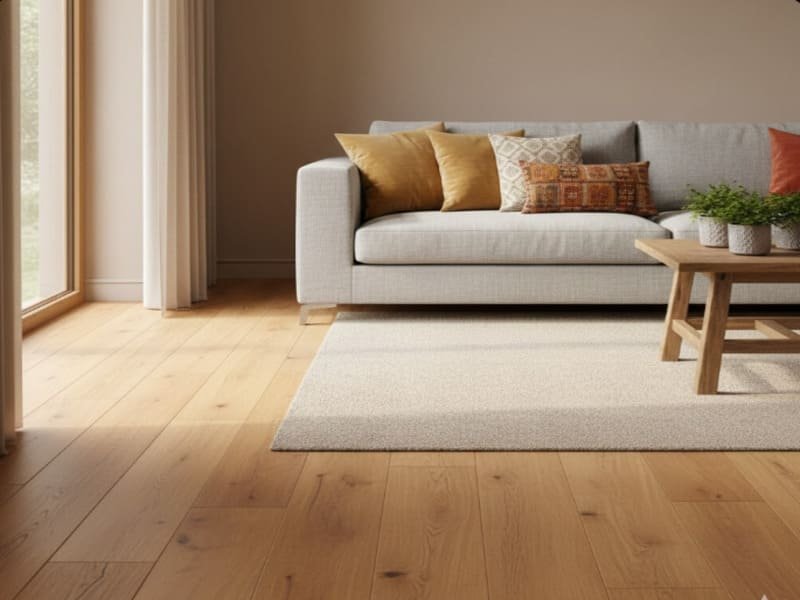
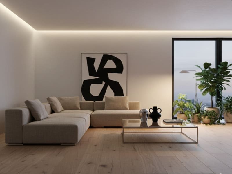
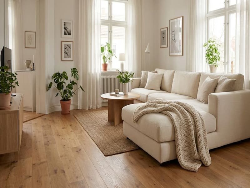
Both strategies work depending on the desired spatial effect. Dark Floors with Light Furniture create drama and modernize the space. Light Floors with Dark Furniture anchor the room. Tone-on-Tone offers a monochromatic organic look but risks a "floating" effect if textures are not varied.
The Physics of Contrast and Visual Weight
Contrast is about how light is absorbed or reflected in a room. In product development, we measure Light Reflectance Value (LRV). High contrast between floor and furniture creates clear visual boundaries, which is generally pleasing to the human eye.
Scenario Analysis:
-
Dark Floors + Light Furniture (High Contrast):
- The Engineering: Dark floors (Low LRV) absorb light, grounding the room. Placing light furniture (High LRV) on top creates a "pop" effect.
- Result: Dramatic and modern. This prevents the room from feeling like a cave.
- Best For: Large rooms with ample natural light.
-
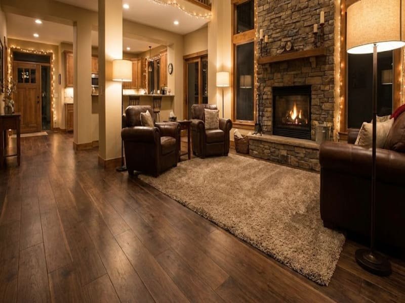
Light Floors + Dark Furniture (Grounding):
- The Engineering: Light floors reflect light, making the space feel expansive. Dark furniture provides necessary "anchors" so the eye has somewhere to rest.
- Result: Airy and spacious.
- Best For: Smaller rooms, Scandinavian or Minimalist styles.
-
Tone-on-Tone (Monochromatic):
- The Risk: If the LRV of the floor and furniture is identical, the furniture legs visually disappear into the floor. This creates a disorienting "floating" sensation.
- The Fix: If you choose this route, you must rely heavily on texture. A smooth polished floor needs a rough, matte, or fabric-heavy furniture piece to create separation.
Contrast handles the brightness, but the most technically difficult challenge is mixing two organic materials, specifically placing wood furniture on wood floors.
How Can I Mix Wood Furniture with Wood Floors Successfully?
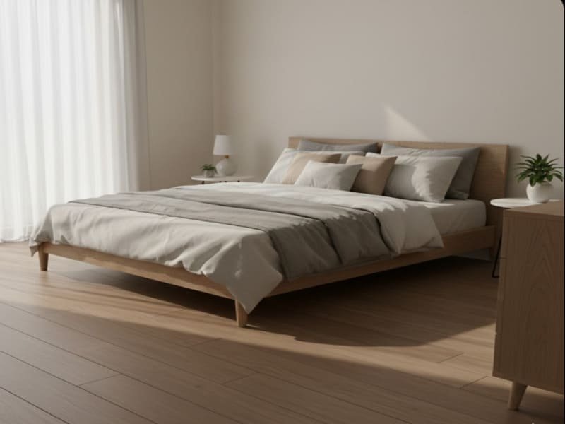
Apply the "Two-Shade Rule": Furniture must be at least two shades lighter or darker than the flooring. Never match perfectly unless custom-made. Mix grain scales—pair busy floor grains (like Hickory) with quiet furniture grains (like Maple). Use rugs as a "buffer zone" to break visual continuity.
Mastering the "Wood on Wood" Challenge
As someone who deals with wood grain printing and embossing technologies, I know that trying to match two different wood species is nearly impossible. Even the same species from different harvest batches will have variation. Therefore, the goal is coordination, not matching.
The Two-Shade Rule:
Never try to get the colors "close." If they are close but not identical, it looks like a mistake. Instead, ensure a significant delta in color depth. If your floor is a mid-tone Oak, your dining table should be either a very dark Walnut (darker) or a very pale Ash (lighter).
Grain Pattern Engineering:
You must also consider the "frequency" of the grain.
- High Frequency (Busy): Floors like Hickory or rustic grade Oak have a lot of knots and variation.
- Low Frequency (Quiet): Woods like Maple or Select Grade Oak are uniform.
The Engineering Logic:
- Busy Floor + Busy Furniture = Visual Chaos. The eye cannot focus.
- Busy Floor + Quiet Furniture = Balance. The furniture calms the floor.
- The Buffer Zone: Sometimes, you just want that specific table on that specific floor. In this case, you need a gasket—a Rug. A rug acts as a visual isolator, breaking the contact point between the wood leg and the wood plank, resetting the eye’s color calibration.
We have covered the materials; now we need to ensure the physical materials align with the overall design language or "vibe" of the room.
Which Furniture Style Matches My Floor Type?
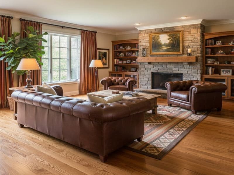
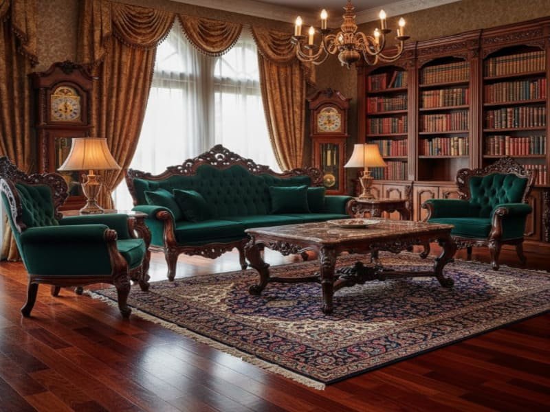
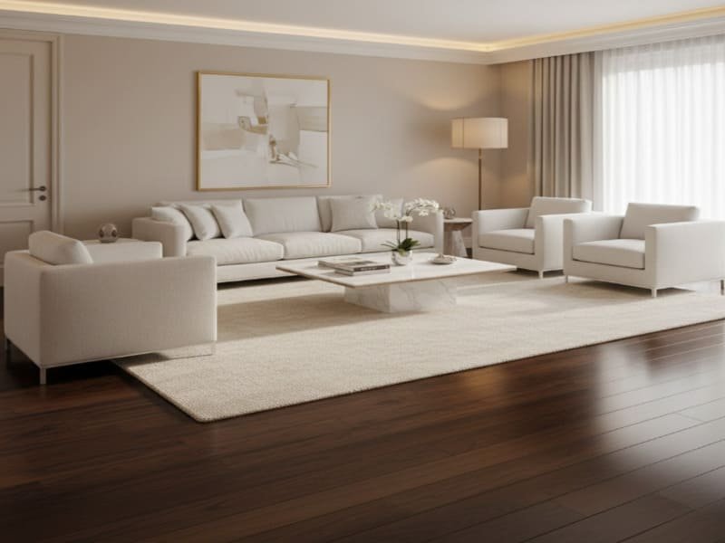
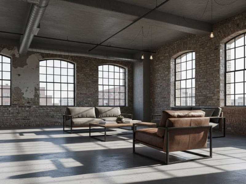
Match the texture and finish to the era. Rustic floors (distressed oak) need reclaimed wood. Modern floors (polished concrete/maple) require sleek lines and glass. Industrial floors (concrete/brick) pair with raw steel and leather. Traditional floors (Mahogany/Parquet) demand ornate details and rich fabrics.
Consistency in Material Philosophy
When developing flooring products, we design them for specific applications. A high-gloss, pristine marble-look PVC tile is engineered for a different environment than a hand-scraped, matte-finish rustic plank. Your furniture must respect this engineering intent.
Style Compatibility Matrix:
| Design Style | Flooring Characteristics | Recommended Furniture Materials |
|---|---|---|
| Rustic / Farmhouse | Distressed, wide-plank, warm oak, matte finish. | Reclaimed wood, matte finishes, slipcovered linen sofas, wrought iron. |
| Modern / Minimalist | Polished concrete, very light maple, or very dark ebony. | Sleek lines, chrome/stainless steel accents, glass, high-gloss lacquer. |
| Industrial | Concrete, gray-toned wood, brick, rigid core vinyl. | Raw steel, distressed leather, rough-hewn wood, exposed mechanical elements. |
| Traditional | Mahogany, Cherry, intricate Parquet patterns. | Ornate wood details, rich velvet fabrics, matching warm wood tones, brass. |
The Clash:
Imagine placing a sleek, high-gloss white plastic chair on a rough, hand-scraped rustic barn wood floor. The texture disconnect is jarring. The "vibe" is essentially the texture profile. Keep matte with matte and gloss with gloss (generally) to maintain a coherent narrative in the room.
Even with the best planning, sometimes things don’t look right. Let’s look at the "Bridge Elements" used to correct these mismatches.
How Can I Fix Mismatched Floor and Furniture?
Use "Bridge Elements" to disrupt the visual clash. A rug is the most effective tool to separate floor from furniture. Adjust wall colors (e.g., white walls balance dark wood). Incorporate metals and upholstery (brass, velvet) to break wood dominance. Use accessories to carry the floor color upward.
The "Bridge" Concept in Interior Engineering
In engineering, when two incompatible materials must meet, we use an interface layer. In interior design, if you already own furniture that doesn’t quite match your new floor, you don’t need to throw it away. You need an interface layer or a "bridge."
1. The Rug as an Isolator:
This is the number one fix. If your wood table clashes with your wood floor, a neutral grey or cream rug physically separates them. The eye registers "Table -> Rug -> Floor" rather than "Table vs. Floor."
2. Wall Color as a Mediator:
Walls account for the vertical visual field. If you have dark floors and dark furniture, the room feels heavy. Painting the walls a crisp white or a very light cool grey acts as a reflector, bouncing light back into the room and balancing the heavy mass of the dark wood.
3. Material Diversification:
Stop adding wood. If the wood tones are fighting, introduce non-wood elements. A brass coffee table, a glass console, or a velvet sofa breaks the pattern. This reduces the "wood dominance" in the room, making the clash between the floor and other wood elements less noticeable.
4. Vertical Color Integration:
If you have a reddish floor but neutral furniture, put reddish throw pillows on the couch. This pulls the floor color "up" into the room, making the floor feel like an intentional part of the palette rather than a separate entity.
We have fixed the mismatches, but environmental factors like lighting and room physics play a massive role in how these colors are perceived.
How Do Lighting and Room Size Affect My Choice?
Natural sunlight (warm) versus artificial LEDs (cool) changes floor appearance due to metamerism. Always test samples at different times. Regarding size: Light floors expand small rooms, while dark floors make large rooms cozy. "Leggy" furniture on dark floors reveals more surface area, creating an illusion of space.
Metamerism and Spatial Physics
Metamerism is a phenomenon where two colors match under one light source but look different under another.
- Natural Light: Usually warm (yellow/red). It enhances warm undertones in wood.
- Artificial Light: Depends on the bulb (Kelvin rating). A 5000K daylight bulb is very blue and can make a warm oak floor look greenish or sterile.
- The Fix: Never buy flooring or furniture based on how it looks in the showroom. Bring a sample home. Observe it at 9 AM, 2 PM, and 8 PM.
Room Size Physics:
- Small Rooms: You want to maximize the "visible floor area." Light floors reflect light to the corners, expanding the boundary. If you use dark floors in a small room, use furniture with legs (sofas raised off the ground). This allows the eye to see the floor continuing underneath the furniture, tricking the brain into thinking the floor plate is larger than it is.
- Large Rooms: Large open-concept spaces can feel like a gymnasium if not grounded. Dark floors absorb light and pull the visual ceiling down slightly, making the space feel intimate and residential rather than commercial.
To summarize everything into an easy-to-use format, here is a quick reference guide for your decision-making.
What Are the Quickest Matching Combinations?
Follow this cheat sheet for guaranteed results: Red/Warm Floors pair with Cream, Beige, and Dark Leather (Avoid Yellows). Gray/Cool Floors pair with White, Black, and Blonde Wood (Avoid Red/Orange). Natural/Beige Floors are "Universal Donors"—pair with almost anything.
The Cheat Sheet: Quick Matching Combinations
If you want to bypass the theory and just want a safe, engineer-approved combination, use this table. These pairings have been tested to ensure sufficient contrast and harmonious undertones.
| Floor Undertone | BEST Pairing (Go for this) | AVOID (Don’t do this) |
|---|---|---|
| Red / Warm (Cherry, Mahogany) | Cream upholstery, Beige, Dark Brown Leather, Green accents. | Yellow-toned woods (creates a clash), bright red (too intense). |
| Gray / Cool (Ash, Concrete, Slate) | White, Black, Cool Blues, Blonde (Maple/Birch) for contrast. | Red or Orange-toned woods (looks dated and jarring). |
| Natural / Beige (White Oak, Hickory) | The Universal Donor. Works with dark walnut, black, white, or colorful fabrics. | Matching the exact shade too closely (looks washed out). |
| Dark / Espresso (Walnut, Ebony) | Light woods (Maple), White, Light Grey, Jewel tones (Emerald, Navy). | Dark furniture (unless aiming for a very specific moody monochrome look). |
Actionable Takeaway:
Take a photo of your floor. Hold it against this chart. If you are buying a sofa, bring a physical piece of your flooring to the furniture store. If you are buying flooring, bring a cushion from your sofa to the flooring showroom. Physical verification is the only way to be 100% sure.
Conclusion
Matching your floor to your furniture is about managing Undertones and Contrast. Use the "Two-Shade Rule" to prevent visual stagnation, leverage rugs as buffers for mismatched items, and always test samples under your specific lighting to account for metamerism.
FAQ Section
Should furniture be lighter or darker than the floor?
There is no single rule, but you need contrast. If you have dark floors, lighter furniture helps the room feel open. If you have light floors, darker furniture grounds the space. Avoid having both be the exact same shade, or your furniture will disappear.
Does gray flooring go with brown furniture?
It depends on the undertone of the brown. Gray is "cool." It works best with browns that have no red or orange in them (like a cool, dark walnut or a beige). Avoid pairing gray floors with reddish cherry wood or orange oak, as the cool and warm tones will clash.
How to mix different wood tones in a living room?
Follow the Dominant vs. Accent principle. Let the floor be the dominant wood tone. Choose furniture that is significantly different in color (2-3 shades away). Also, vary the grain: if the floor is rustic and knotty, choose furniture with a smooth, straight grain to prevent visual clutter.
Can you put a rug over carpet to match furniture?
Yes, this is a great layering technique. If your rental apartment has a carpet color that clashes with your furniture, layering a large area rug over the carpet acts as a "buffer," creating a new foundation that matches your style better.
About the Author
I am a Floor R&D Engineer with over 15 years of experience in material formulation and production process design. I specialize in the technical properties of PVC flooring, artificial turf, and custom matting solutions. My work bridges the gap between manufacturing precision and practical interior application, helping clients optimize both performance and aesthetics.
Ready to find the perfect floor that matches your vision?
Stop guessing and start building. [Contact my team today] for a free consultation on our custom flooring solutions or to request material samples. Let’s engineer the perfect foundation for your space.